transit app

Nova Harbour Transit

ROLE

UX/UI Designer

timeline

May-July 2024

collaboration

Mentor: Josh Skinner

Art Director: MacKenzie Martin, Ria Chopra

Co-Designer: Lucy Chen

Nova Harbour Transit is a transit app designed to help residents and visitors of Nova Harbour navigate easily. This project was part of a project-based mentorship program organized by RGD, where I was tasked with designing a transit app for Nova Harbour, a fictional small town in Ontario where buses are the main mode of transportation.

As the UX designer, I collaborated closely with another designer, art directors who provided design systems, and my mentor for guidance. My main tasks included conducting a competitive analysis of existing transit apps, combining these findings with user personas to identify user pain points, creating user flows, and developing solutions for live navigation experience of the app.

Problem Statement

How might we help our users plan their day with accurate schedules and straightforward navigation?

Our Solution

A transit app with step-by-step live navigation process, real-time updates, and saved routes for effortless daily journeys.

Highlights

Home

Check current location and search for new places.
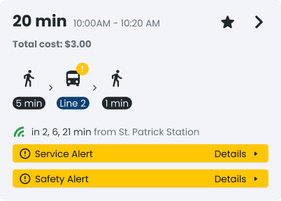
Route Details

Details of selected route, including directions and bus information.
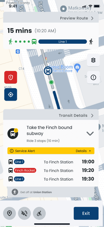
Live Navigation

Real-time route tracking and step-by-step navigation.

Saved Routes and Places

Show favourite routes and places.

Understanding Our User

Learn from Competitors

I started by exploring popular transit apps in the app store. I wanted to understand what’s out there—what makes certain apps popular and why, and where they leave users wanting more. Specifically, I took a look into the specific features that each app are popular for.

From analyzing these apps, I found that popular transit apps focus heavily on providing real-time updates and step-by-step guidance but often struggle with overcrowded interfaces or unclear instructions, leaving users overwhelmed during live navigation.

Our User Profile

We conducted more than 5 interviews with our surroundings to identify their struggles and expectations on current transit apps. Based on their feedback, we identified key pain points that highlight common challenges users face.

Inconsistent Schedules

Users are frustrated with late and crowded buses, as well as inaccurate app tracking that leads to long waits.

Outdated Information

Delays and service notices are not always updated in real-time, causing frustration and missed connections.

Complex Navigation

Overly complicated routes can leave users confused and unsure of their next steps.

Unintuitive Design

Unclear interfaces and overwhelming information.

Exploring Ideas

Crazy 8's

Based on the research and user pain points, we used the Crazy 8's brainstorming technique. Each team members were challenged to sketch eight distinct solutions in eight minutes.

From there, we categorized our ideas and picked the top features from the ideation workshop to address the pain points from the research.

Real-time updates based on user feedback.

Simplified route navigation process

Personalization options such as saving routes and places

User Flow

We narrowed the focus of the app to helping users plan trips and follow directions. We then mapped out the user flow based on this. From here, we identified the screens to focus on and detailed what each screen should include.

Hover over to see what we planned to include as key features and content for certain screens.

We narrowed the focus of the app to helping users plan trips and follow directions. Based on this, we designed the user flow specifically for this core functionality. From the user flow, we identified the main screens to focus on and detailed what each screen should include.

Press on the user flow to see the screens that we selected to prioritize.

We narrowed the focus of the app to helping users plan trips and follow directions. We then mapped out the user flow based on this. From here, we identified the main screens to focus on and detailed what each screen should include.

Press to see what we planned to include as key features and content for certain screens.

Designing the Solution

Testing Our Ideas

We started by drafting different versions of each core screen from the user flow. Then, we picked out the strongest elements and combined them together for hi-fidelity. We prioritized with the choices that helps users complete a task more efficiently.

For the home screen, we found rectangular tabs clearer than rounded ones, as they kept icons and labels connected. Listing saved locations first also proved more effective than categorizing saved places and nearby attractions, offering quicker access to frequent spots.

We experimented with displaying the user's current location in the background but found it distracting, as the map competed with the route details, making it harder for users to focus on their options.

We then explored text-based routes with a route overview vs. simplified step breakdowns. We also found that having too many secondary buttons in the same area could distract users from the main actions.

We organized the route into step-by-step cards, allowing users to swipe away each step as they complete it, to ensure users easily track their progress without feeling overwhelmed.

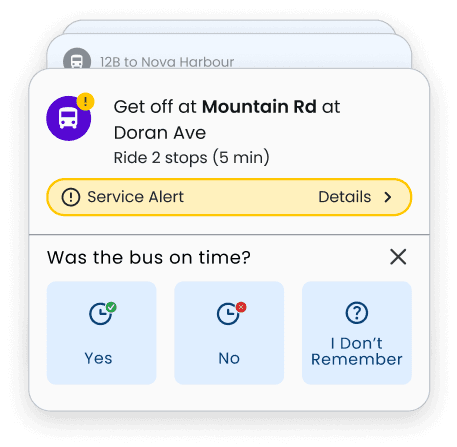
We also thought about adding a pop-up window to gather user feedback on their onboard experience, to improve future navigation and service quality.

Highlights on Iterations

Before
After

Users swipe through tabs to access nearby attractions.

A report button in red for any safety concern.

Larger, clearer preset location buttons for quicker navigation.

Introduced an "Explore" button for easier access to nearby attractions.

Small transit numbers made it harder for riders to identify their route quickly.

Alerts used a single colour, making it hard to distinguish their purpose.

Different colours are assigned to various alert types.

Bus numbers are now larger, ensuring they are easier to read. A unique colour is added for buses, improving visual clarity.

Took the idea from existing apps that users can scroll to see other route options without going back.

Enhanced it to scrolling cards, making it easier for users to select their preferred route.

Clearer indications with larger icons and better spacing to highlight essential route details.

Larger, more visually dominant CTA.

An accessibility button to show wheel-chair accessible places.

Secondary buttons were cluttered, drawing unnecessary attention away from primary navigation.

Navigation details were broken to smaller steps, but still felt static and less intuitive to interact with.

Organized secondary buttons to maintain focus on the main route.

Introduced scrolling cards inspired by familiar designs (Apple Wallet) for a more user-friendly and visually appealing experience.

Accessibility button is moved to the top for less distraction while keeping it accessible.

The onboard questionnaire opened as a new page, taking users away from the navigation flow.

A pop-up question appears within the live navigation card, minimizing disruption and keeping users focused on their journey. Quick, one-tap feedback options ensure higher completion rates.

Highlights on Iterations

Before

Users swipe through tabs to access nearby attractions.

A report button in red for any safety concern.

Introduced an "Explore" button for easier access to nearby attractions.

Larger, clearer preset location buttons for quicker navigation.

After

Small transit numbers made it harder for riders to identify their route quickly.

Alerts used a single colour, making it hard to distinguish their purpose.

Different colours are assigned to various alert types.

Bus numbers are now larger, ensuring they are easier to read. A unique colour is added for buses, improving visual clarity.

After
Before

Took the idea from existing apps that users can scroll to see other route options without going back.

Clearer indications with larger icons and better spacing to highlight essential route details.

Larger, more visually dominant CTA.

Enhanced it to scrolling cards, making it easier for users to select their preferred route.

Before
After

An accessibility button to show wheel-chair accessible places.

Secondary buttons were cluttered, drawing unnecessary attention away from primary navigation.

Navigation details were broken to smaller steps, but still felt static and less intuitive to interact with.

Accessibility button is moved to the top for less distraction while keeping it accessible.

Introduced scrolling cards inspired by familiar designs (Apple Wallet) for a more user-friendly and visually appealing experience.

Organized secondary buttons to maintain focus on the main route.

Before
After

The onboard questionnaire opened as a new page, taking users away from the navigation flow.

A pop-up question appears within the live navigation card, minimizing disruption and keeping users focused on their journey. Quick, one-tap feedback options ensure higher completion rates.

Before
After

Highlights on Iterations

Before
After

Users swipe through tabs to access nearby attractions.

"Explore" button for easier access to nearby attractions.

Larger, clearer preset location buttons for quicker navigation.

Report button in red for any safety concern.

Small transit numbers made it harder for riders to identify their route quickly.

Single colour, hard to distinguish purpose.

Different colours are assigned to various alert types.

Bus numbers are larger, easier to read. Unique colour is added for buses, improving visual clarity.

Took the idea from existing apps that users can scroll to see other route options without going back.

Larger, more visually dominant CTA.

Clearer indications with larger icons and better spacing, highlight essential route details.

Enhanced it to scrolling cards, making it easier for users to select their preferred route.

Navigation details were broken to smaller steps, but still felt static and less intuitive to interact with.

An accessibility button to show wheel-chair accessible places.

Scrolling cards inspired by familiar designs(Apple Wallet) for a more user-friendly and visually appealing experience.

Accessibility button is moved to the top for less distraction while accessible.

Organized secondary buttons to maintain focus on the main route.

The onboard questionnaire opened as a new page, taking users away from the navigation flow.

A pop-up question minimizing disruption and keeping users focused on their journey. One-tap feedback options ensure higher completion rates.

Final Design

Plan and Navigate

Users log in, choose a destination, explore route options, and view detailed route steps. The live navigation feature guides users through their journey with clear, interactive instructions, while a lightweight survey gathers feedback without disrupting the flow.

Save routes/PlACES

Users can find their frequently used routes or favourite stops.

Screens

sign up/login
sign up/login
sign up/login
home
home
home
route options
route options
route options
route details
route details
route details
live navigation
live navigation
live navigation
pop-up question
pop-up question
pop-up question
saved routes/places
saved routes/places
saved routes/places

Design System

Typography, Colour Palette and Components

Reflections

Working on this transit app was a fun experience. I had a great time collaborating with my team, gaining practical experience, and refining my design skills. As this was my first time designing a transit app, I had the time to rethink my route planning process and notice many small details that current transit apps use to make this process easier. I also identified several design decision-related problems that I encountered in previous UX projects, and I was able to get valuable inspiration and help from my mentors and peers.

To further enhance the app, here are some steps we could consider exploring:

Conduct user testing

Further security, such as a feature that allow users to share their planned trips

Add stops of nearby places along the current route , as current map doesn’t show nearby/saved places during a live navigation